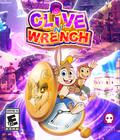
Sometimes you want a game to succeed. Clive 'N' Wrench is one of those games. A decade in the making and the one-man passion project of Rob Wass, it's a game that clearly has a lot of time, effort and love put into it. It's the little game that could, and every ounce of my movie-loving heart wants to see the plucky game triumph over adversity and prove that it can be just as good as the big boys. A 3D platformer collect-a-thon that's out to prove the genre still has legs, Clive 'N' Wrench is full of verve and care. It feels like something I'd easily fall in love with.
Unfortunately, Clive 'N' Wrench isn't very good. It doesn't hit the mark, but it occasionally comes close. Probably the biggest issue is that almost none of the actions in the game feel good. Platforming feels stiff and awkward. It's functional most of the time, but it's frustrating to try to do precision platforming, which results in your bunny protagonist randomly deciding to not grab a wall and plummeting to his death. It doesn't help that the in-game camera is pretty bad and moves at the pace of a snail. The game tries to have some Mario 64-style tricks — but without the precision that made Mario 64 work.
Maybe things would be better if combat were more enjoyable, but it isn't. It suffers from a lot of the same problems as platforming. Fighting is done with the old classic of "jump on enemy" or "spin into enemy." Unfortunately, everything feels weird and imprecise, and there were plenty of times that I took damage not because I made a mistake but because the enemy hitboxes were so awkward. You don't even get frames when you get hit, which can lead to all of your health vanishing in an instant. Boss fights are particularly bad and perhaps the low point of the game because they tend to force together all of the awkwardness of platforming and combat to create an unholy synthesis where neither part works as it should.
Alas, this lack of quality continues on to the level design. I get what they are going for because '90s-era collect-a-thons have their place, and there's certainly plenty of nostalgia for it. The levels are too large and too empty, though. You want a large open space to explore in a collect-a-thon, but Clive 'N' Wrench seems to mistake quantity for quality; there's an obscene amount of different collectibles to grab, but the space in which you collect them feels boring. It puts the act of collecting ahead of what made '90s collect-a-thons shine, which is making you feel like those collectibles were a reward. Yeah, there's a lot to collect. Watches and stones and widgets and whoosits are scattered everywhere, but unless the act of collecting something makes you happy, there doesn't seem to be a reason to go through with it.
It doesn't help that the game is incredibly poorly optimized on the Switch. It has frequent and absurdly long loading times, and with several areas split into multiple parts, it drags down the pace of exploration. The game has near-constant graphical bugs and glitches, and while it only broke a few times, it always felt like it was one good push away from letting me clip through a wall or fall to my death.
Not even the plot is particularly fun. While the game looks like a Saturday morning cartoon, the actual story (something involving space-time breaking and an evil scientist) is relegated to the sidelines, and nothing feels like it's connected to it. It's mostly an excuse to have a variety of different stage aesthetics. There's nothing wrong with that — Mario has done it plenty of times — but to make that work, your characters need some charm, and there is none here.
I feel particularly bad criticizing the graphics for a game like this, but it's difficult to get around the fact that it feels cheap. Animations are weightless, environments are frequently poor textures, and the characters don't have any personality in their designs or movement. You could swap out your bunny pal for pretty much anything else in the world, and I don't think much would change. There are some creative ideas to be found in the level design (the first level where you play as a shrunken version of your character exploring a giant house is probably the best executed one in the game), but the presentation doesn't match the ideas. You can do a lot with a little as games like A Hat In Time show, and if it were just lower budget, it wouldn't feel as necessary to point out. Likewise, the music is bland and unmemorable. Not every one-man project can have a Toby Fox. The audio isn't bad, just lacking.
I genuinely feel rather bad going on and on about the game's flaws, but the most exceptional thing about Clive 'N' Wrench is the effort that went into bringing it into existence. I'd love to say that it's a great, or even a good, game, but it's pretty unexceptional even by the standards of low-budget indie 3D platformers. There just isn't anything to recommend this game on its own merits, and it is buggy enough that it's hard to even recommend it as a curiosity.
Score: 5.0/10
More articles about Clive 'N' Wrench


 Clive 'N' Wrench is a 3D platformer centered around Clive, a rabbit, and Wrench, the literal monkey on his back.


