The match-three gem puzzle genre is beyond saturated at this point, and things have gotten so bad that we're now making rip-offs of rip-offs. Jewel Master: Egypt is basically a reworking of Jewel Master: Cradle of Rome, which was itself a cheap knock-off of Bejeweled. The result is an insipid, uninspired, boring title that won't keep you entertained for more than a day.
Obviously the objective of this game, like all others in its genre, is to match at least three like icons to remove them from the board. The twist in the Jewel Master franchise is that some of these icons sit on top of blue tiles, and it is these specific tiles that you must break in order to pass the level. Furthermore, the entire experience is timed, so you have to be quick in order to beat each stage. Of course, the game ups the challenge as you go by throwing in locked spaces, weird stage designs with hard-to-reach tiles and an ever-shortening time limit. The basic elements aren't all that bad, but the entire experience grows extremely tedious and boring in a very short span of time.
In an attempt to create context for all this gem-matching, the game also introduces three different types of resources that you must collect in order to grow and upgrade your kingdom. Gather enough food, building materials and treasure and you can build livestock farms, walled cities and even the Great Pyramids. The upside of all this nation-building is that you to can build up your reserves more quickly and also gain access to special power-ups to make the entire experience theoretically easier. Unfortunately, this whole mechanic is little more than a thin veneer trying to mask the fact that this game isn't deep or complex enough to truly have any sort of underlying purpose.
This point is most easily evidenced through the power-ups, which are implemented so sloppily they may as well not exist at all. Throughout the course of the game's 100 stages, you can access an ever-increasing array of new abilities, but you're restricted to only using one of those powers in any given stage. Furthermore, the game randomly determines which power-up you get every time you start a level, so you may be saddled with the skill that allows you to destroy one tile when you've already purchased the ability that will let you destroy nine tiles. As you get into the last half of the game, many players will find themselves constantly restarting stages until the title sees fit to provide them with a power-up that will actually be useful. The far more elegant solution would have been to let gamers choose their special ability before each level or even swap them on the fly during the stages, but that's not the way things are done here. Even worse, a good number of the power-ups are practically worthless from the start, so it really feels like you're fighting with one arm tied behind your back.
The resources that pop up in each stage operate the same way, so it's easy to end up with a ridiculously large stockpile of something like food while having a treasure chest that is practically empty. Again, if you really want a specific resource, you'll have to repeatedly restart the levels in order to force the game into giving you what you really need. It's another problem that probably could have been fixed during the development stages, but seeing as this is a budget title, it's unlikely anyone ever thought such considerations should be made.
Another big drawback is the size of the tiles, which can make manipulation of the icons harder than it should be. While the stylus controls are pretty reliable, the boxes are quite tiny and it's easy to accidentally grab the wrong piece from time to time. Making matters worse are the locked icons, as the chains used to represent their locked status make it nearly impossible to see what resource is hidden underneath. This can lead to severe frustration as players finagle pieces around in order to attempt to unlock the chains, only to discover that the piece underneath was a hunk of gold rather than a brick, and now they're even further from success than when they had started.
The size and detail of the tiles is just one symptom of the game's widespread presentation shortcomings; the graphics and sounds were all clearly of very little concern to the development team. Animation is nearly non-existent, and the visuals that do exist are very primitive and drab. Most of the artwork looks like a high school art project, and not a particularly good one at that. The music is similarly underwhelming, with simplistic bleeps and bloops layered over a sparse soundtrack. The whole thing just screams boring, which doesn't do a thing to help the generic gameplay.
Overall, there's very little reason to pick up Jewel Master: Egypt when there are so many better options available. Even though the game is dirt-cheap at this point, so are Peggle, Bejeweled, Professor Layton and a number of other titles. This title is an unoriginal, yawn-inducing experience, and it's next to impossible to draw out any lasting enjoyment.
Score: 5.0/10
More articles about Jewel Master: Egypt







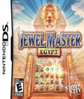 Welcome to the country of the Pyramids and the Sphinx, the cradle of civilization! Match 3 sources of wood, gold and more to create Egypt. Proceed on a time trip back to the origins of old Egypt, and witness the origin of one of the most fascinating cultures in the history of Humanity!


