Orcs & Elves marks one of the first games developed specifically for the mobile platform that has crossed over to another game-specific device. The Orcs & Elves franchise has been lauded for marrying the storytelling and visuals of the fantasy RPG genre with the accessibility of the mobile format, which has appealed to casual and hardcore gamers alike.
id Software has crafted an entirely new version of Orcs & Elves that utilizes the Nintendo DS unique technology platform. Orcs & Elves will feature higher graphical fidelity, more levels, items and monsters as players explore a massive Dwarven kingdom riddled with ancient treasures and fierce enemies. The game features hybrid gameplay, combining the best of first-person action and fast-paced tactical RPG gameplay.
My name is Katherine Anna Kang and I'm CEO and Producer at Fountainhead Entertainment -- developers of id Software's Orcs & Elves.
Past Projects:
- 2003 - In The Waiting Line (Co-Producer and Designer)
- 2004 - Game Over (Co-Producer and Designer)
- 2005 - DoomRPG mobile (Producer, Writer and Designer)
- 2006 - Orcs & Elves mobile (Producer, Writer and Designer)
- 2007 - Orcs & Elves DS, Orcs & Elves II mobile (Producer, Writer and Designer)
From Cell Phones to the DS:
Our first foray into the mobile gaming sector was DoomRPG. It was a great title to work on -- the known IP, the beloved characters, and just working on a Doom game is cool. It took us 4 months to develop. We were able to learn about cell phone game creation and take that knowledge several notches higher with Orcs & Elves. Orcs & Elves on the cell phone was probably the most difficult game we have created to date. We had to come up with a brand new universe with complex characters all the while giving those characters life (even if dead). Unlike DoomRPG, we didn't have the privilege of taking existing media and we didn't have an existing fan base to back up the game. The Orcs & Elves universe had to be created from ground zero, the story, the characters, the media, the sounds, the music... the only thing that stayed was the core technology. All of this had to be done within 6 months. At about month 5, we had completed the high-end BREW version of Orcs & Elves, and though we were disappointed at how many ideas we had to omit, we were thrilled with the final product. Orcs & Elves was hell of a fun game, looked great, and even after hundreds of hours of combined play time, we still enjoyed the game.
When talk of a DS version of Orcs & Elves came around, we were thrilled about the prospect of bringing back all of the game ideas we had to leave out on the cell phone version due to limitations. We were liking the bottom-up approach -- take all of the things that we wanted to include in the original game, save it, then implement it on another platform. The initial high of knowing that we were bringing Orcs & Elves to the DS wore off fairly quickly. When we found out about the DS's limitations, we realized that all of the things we wanted to bring back would not make it. On the high-end BREW cell phone version of Orcs & Elves, we had about 1.3 MB of main memory for texture usage. On the DS, we had a total of 512 KB actual texture memory which broke down to:
- 128 KB for the bottom screen.
- 128 KB for static 3D textures on the top screen.
- 128 KB for streaming in dynamic textures for the current frame on the top screen.
- 128 KB for streaming in dynamic textures for the next frame on the top screen
About 1.2 MB of the DS's main memory was used to cache textures that would be streamed in as needed into the 128 KB of current frame dynamic texture memory. This is how we were able to use as many textures as the high-end BREW phone version while having less than half the memory. The total texture count for the DS version is 1348 different images. By contrast, the BREW high-end phone game had 758 total images. We had 6 months to learn to develop on a new platform, recreate the media, add more content, and fit "some" of the ideas that could not make it into original game into the DS version.
As a designer, the look and feel of the game was extremely important but above all else, the game had to be fun. I wanted the player to get into the game for several hours straight and later realize that they had been playing much longer than originally intended. One of the first things that we did to help make this possible was make the interface player-friendly. I had been disappointed at how many DS games were out there that did not allow players to use keys only or touch-screen only. Some games were such finger twisters that they gave carpal tunnel a new meaning. The first rule in developing our game was to give the player the freedom to choose. As a player, you should be able to use the keys if and when you want, the screen if and when you want, and if you so choose, do a combination of both. It was a bit of work to make sure that everything worked this way but it was well worth the effort.
The visuals were an interesting challenge. With the severely limited texture memory we had at our disposal, we were worried that the DS game would look horrible. It then dawned on us why so many of the other DS games were side-scrollers and why the real 3D games looked so poor. Many of the 3D games had extremely simplistic bottom screens and the top screen had basic colors for walls and ceilings. The one thing that many of these games had were gorgeous pre-rendered cinematics. Unfortunately, with all the media we had to cram in, this just wasn't an option for us since we had to work within the constraints of a 16mb cartridge. Our tried-and-true solution for creating cinematics within a tight memory budget was Machinima. We had to use all of the art assets created for the game to make cinematics. I was extremely jealous of the games that could afford the luxury of pre-rendered CGI cinematics because they looked damned cool but when the actual in-game media came up, there was no doubt in my mind that our game was one of the best looking 3D DS games out there. There were several things we did to improve the in-game look but I think the one I'm most proud of is what we were able to do with the lower touch screen. I hated the idea of a simplistic or ugly lower screen -- that screen would be the place players would go to for inventory management and spell casting; it had to look good. Our idea was to stay with a first person perspective feel. We created an inventory management system where if the player was to look down, he would see his belt and all the items available at a touch. The visuals on the bottom screen had to match the top screen for better immersion.
In the end, though we couldn't go hog-wild with new media, the game has an immense amount of new content for fans of the original version and newbies alike. Things like sheep that you can kill to make lamb chops for food, air vents that boost you to another place or just up in the air, spiral staircases that lead you up and down the layers of the mountain citadel, ladders that take you to secrets, and spell casting are but a small handful of new items we were able to bring to the DS.
At the end of our 6 month development cycle, and despite the limitations, we were really glad that Orcs & Elves made it to the DS. We think the fans of the cell phone version will really have a great time with all the new content we added and hope newbies will love it also.
Orcs & Elves for the Nintendo DS is scheduled to be available for the upcoming holiday season.
More articles about Orcs & Elves





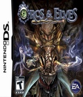 Orcs & Elves is a first-person fantasy role playing game, featuring higher graphical fidelity, more levels, items and monsters as players explore a massive Dwarven kingdom riddled with ancient treasures and fierce enemies. The game features hybrid gameplay, combining the best of first-person action and fast-paced tactical RPG gameplay.


