Developer Diary
Designing The Trauma Center: Under the Knife 2 Game Cover
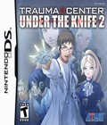
When our Japanese partners asked what we wanted do for the cover on this latest edition of Trauma Center, we looked back at the original Under the Knife with its dramatic gestural feel and asked them to take their lead from that image. Thus, Derek and Angie are back on it, front and center. After a brief vacation from the series in New Blood, the thoracic duo have returned to take their rightful place in this, the most important of our marketing materials. We like character art and so do our fans so we made sure to use some of our most identifiable characters on the cover this time. In fact, one of the reasons that we did not use figural art on the front of the New Blood packaging was the absence of Derek and Angie from the game. We felt Vaughn and Blaylock, at least in the art we had available, weren't enough to capture gamers' attention. That's no slight to the character art for that game though, and if you haven't tried it out, you are missing one of the best games available for the Wii system.
Let's dig in and look at our cover, shall we? You may note a change in the rendering style of the characters. The designer for New Blood, who was not the artist for the original Under the Knife, has worked on all the character designs for UTK2. Here, Derek throws up a charged hand (our addition, perhaps not to be seen in Japan) as his costars back him up displaying the appropriate amount of tension and admiration. All this within a misty blue background that hints at his supernatural surgical prowess. Angie is admittedly looking a little anachronistic in her blue maid café inspired nurse's habit, but it's a fresh twist on things and I hope that gives you cosplayers out there some extra inspiration this year at anime conventions. It's a nice change for her after a couple of years stuck in the pink and white nursing standards. The more I look at it, the more I think of the background as a sort of lab slide, like something seen only under a microscope. I don't know if the diffuse blue motif will stand out well on the shelves, but its attractive in and of itself. Check out Nintendo Power to see the image in its full glory.
We also discussed with our Japanese design team as to where the title was going to be placed. Here in the U.S., we like to place our title higher on the box, which fans will note is less often the case for Japanese packaging. We like ours high in case our package is sold in a retail bin where the bottom ¾ of the cover may be hidden. We don't always get layered art, and even when we do, some parts are fixed, so the designers really need to communicate with one another to make sure they get modifiable material whenever possible. This image was originally designed for the title to hit low, but with a little shifting here and there, we were able to create something that works better for us up high without losing the too much of the designer's original feel (at least we hope so, you guys be the judge on that).
Ahh, now, the title. There was a lot of debate over the title itself. Do you like the simple use of "2" to denote this as a sequel? Usually, we try to be a bit more clever with our Trauma Center subtitles and believe me, there were a few other candidates; The Hands of Fate, Syndrome, Surgeon's Oath, and my personal fave, Under the Gun. There were over a dozen considered, but in the end, a lot of the decision came down to how and where it would be graphically presented. How would the EKG line pass through the title treatment? Would certain retail stickers cover up parts of it? How much of this can fit on the spine without having to go to straight font and still be reasonably readable? All questions the team asked itself. And the most important consideration, the fact that this has been one of our most successful games, so why radically change a title that works? All of this added up to keeping "Under the Knife" and just adding the "2". It doesn't bowl you over, but it does the job and doesn't alienate our already solid Trauma Center fan base with a title that might not be well received (start making your jokes about "The Hands of Fate" now).
Gosh diary, I get to have a lot of fun here in the marketing/creative design department of Atlus USA. But creating the cover is an extremely important part of what the marketing group does. We brand ourselves with this image. From the moment we begin our announcements, we know the cover is going to be an icon, a touchstone for the game for its entire shelf life. So, we work hard to create interesting, recognizable, and desirable images for our fans to identify with. You are going to see this box online and on shelves, praised and ridiculed, and yes, people might even judge the quality of the game itself according to the picture on the box. You may not be able to judge a book by its cover, but I have noted that game buyers have no such qualms when they are scanning the glimmering cellophane lined walls of the game store. So here's hoping this "something old/new, borrowed/blue" theme is a pleasing marriage of concept and design for old fans of the series as well newcomers to the fascinating world of simulated medicine...(cue the theme from Quincy)...
- Jeremy Cail, creative designer
GUILT is no more. Dr. Derek Stiles and Nurse Angie Thompson faced humanity's greatest threat and triumphed. Now, in the aftermath, they find themselves in unknown territory, forced to deal with the disastrous consequences of the killer virus. Join them as they scramble to address questions left unanswered and put an end to the mystery behind the disease.
Key Features
- True sequel to Under the Knife - Scrub back in to Nintendo DS for the next chapter of the award-winning Trauma Center: Under the Knife that returns to the tactile stylus-based experience that made the original a smash hit.
- Derek and Angie are back - Caduceus' preeminent surgical team returns to confront the aftermath of the devastating GUILT epidemic in a brand new story.
- Just what the doctor ordered - With a new easy-play mode, improved tool utility, and clearer directions, playing doctor has never been so much fun.
Trauma Center: Under the Knife 2, rated "T" for Teen, is currently scheduled to release on July 1, 2008.
More articles about Trauma Center: Under the Knife 2


 The fast-paced medical action that made the handheld original a classic is
back, along with all of your favorite Trauma Center characters. Rejoin Derek and
Angie as they deal with the unpredictable aftereffects of GUILT. With numerous
enhancements, including new difficulty modes and new operations, handheld surgeons
have a lot to be excited about.